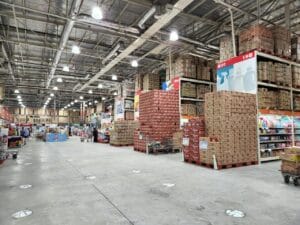
 With big-box stores and sprawling warehouse-style outlets, the space plays a surprisingly big role in consumer behavior. As floor spaces expands out like a Home Bargains outlet, the product ranges diversify and the risk of cognitive friction creeps in – there’s a mental effort required to process everything. It’s no longer an automatic, going through the motions experience of browsing.
For these retailers, it’s tricky to avoid feeling cold and cluttered with all the industrial-grade safety markers, asset tags, and aisle indicators. Functional, but not consumer-focused.
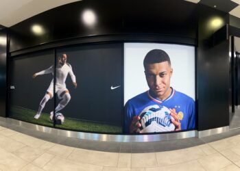
The most successful ones are realising that every square counts – not just with stock, but brand reinforcement and customer communication. By moving to more bespoke identification strategies, businesses can make the warehouse atmosphere less sterile, and instead appear more professional and navigable. Decathlon does this well.
Industrial safety with brand identity
Large retail environments are, understandably, subject to a lot of health and safety regulations like fire exit signage and heavy-load warnings on the shelves. These technical markers must stay, but they needn’t be utilitarian and separate from the brand. There’s no reason to contradict the brand’s typography and colour palette. Here, custom labels can help.
When a customer sees a mismatched industrial label in the middle of a display, it creates a disjointed sense of discord. Custom labeling means you’re able to hit the safety and technical markers, all while aligning the design of safety warnings with the broader brand identity. This attention to details suggests the company is in total control of its environment too, rather than being beholden to external forces, which subconsciously reassures the customer and builds trust. Aestheticizing safety might sound odd, but the retailer effectively moves the customer’s perception of danger toward a feeling of trusted protection.
Cognitive friction
Cognitive friction occurs when a customer is forced to stop and think about where they are or what a certain sign actually means. In such a high-traffic environment, it’s a friction that leads to frustration and feelings of not being welcome – then they leave.
When these aisle indicators and shelving labels are fragmented (as in, varying fonts and materials) they are perceived as clutter – research has found disorganized environments can reduce cognitive focus. This mental tax takes away from what’s meant to be a flow state around a shop.
These elements can reflect a unified brand identity instead and stop being clutter. Then, they are more effective in their guidance. Cohesive visual language means the customer can scan a 50,000-square-foot space and instinctively understand the hierarchy of information, be it identifying a pallet location or providing product specs. Decision fatigue is real, and we need all this energy reserved for purchasing choices, not navigational survival.
Precision in the professional retail environment
The warehouse feel to these stores, which often sit in vast real parks, can come across as cold and even unfinished, but it’s often because of the use of temporary-looking markers or handwritten signs that degrade over time. Professionalism in retail is often measured by the durability and precision of its infrastructure.
Using bespoke identification materials like heavy-duty vinyl communicates a value in quality, not cost-cutting. If a retailer takes the time to make sure even the asset tags on its trolleys or the weight-limit labels on its racks are professionally branded and perfectly aligned, the customer does naturally assume that same level of care extends to the products on the shelves. It’s subconscious and often manifests as brand loyalty – perhaps a recommendation to a friend to visit, and they know they’re in good hands.
Technology’s impact on the experience
Custom labeling isn’t actually just about aesthetics, but also the integration of physical and digital spaces coming together. Large-scale retailers rely heavily on inventory management systems to keep the customer journey smooth, like in high-contrast barcodes or RFID labels, the clarity of these markers leaves a mark.
One example might be when a customer asks a staff member for a stock check, the speed and accuracy of that interaction depend on the store’s labeling system. If labels are worn or poorly placed, the system slows down, leading to long wait times or out-of-stock errors. Bespoke identification solutions are designed for more industrial environments as they’re resistant to moisture and abrasion, but retailers can ensure that their backend technology works perfectly for the frontend user.
Turning the warehouse atmosphere into a trusted space
The goal of custom labeling in large-scale retail is to humanise a massive space. A warehouse is a place for objects, purely functional, while a store is a place for people. Small customisations can make all the difference to the atmosphere. One of the ways to do this is to align all communication to the brand’s identity, from its colours to its fonts. Avoid the utility approach, as it comes across as a lack of customer care.