
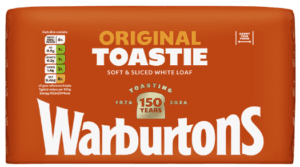
 Warburtons, Britain’s biggest bakery brand, is marking its momentous 150th anniversary with an exciting packaging redesign across its entire 70+ product portfolio.
With a legacy of 150 years of baking excellence and innovation, Warburtons has grown to offer the UK’s largest and most diverse bakery range. This significant brand refresh will unite the brand’s extensive portfolio under a powerful, cohesive visual identity, making products
Developed in partnership with leading brand design agency Taxi Studio, this bold and modern new look is strategically engineered to boost brand recognition and drive sales through:
- Leveraging the cherished and instantly recognisable iconic ‘Baked Orange’ colour: A powerful brand beacon made famous by out-of-home advertising and the delivery fleet. Its consistent application across the entire portfolio creates a dominant ‘wall of brand’ on shelf, making Warburtons products unmissable and simplifying shopper navigation.
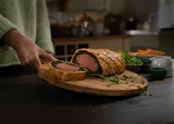
- Revolutionising food photography: Moving beyond static pack-shots, new mouth-watering imagery showcases products prepared and ready to enjoy, inspiring usage occasions and encouraging shoppers to visualise the delicious possibilities.
- Elevating the iconic Warburtons wordmark: Now with a subtle, inviting curve that evokes a smile and reinforces the warmth and togetherness the brand is known for. The trusted ’Family Seal of Quality’ has been elevated, proudly featuring Jonathan Warburton’s signature as a proud testament to the brand’s heritage and unwavering commitment to quality and craft.
Jonathan Warburton, chairman of Warburtons ,added: “As we celebrate 150 years of baking excellence, this bold new packaging marks a pivotal moment for Warburtons. It’s a powerful visual statement that reinforces our position as Britain’s favourite family bakery. For our retail partners, this means unrivalled presence on shelf, streamlined navigation for shoppers, and a powerful system built to drive accelerated and sustained category growth. We’re incredibly excited for consumers to see this new look, which embodies the warmth, quality, and consistency Warburtons is known for, and sets us up for another 150 years of success.”
This ambitious packaging redesign not only solidifies Warburtons market leadership but also sets a new standard for brand consistency and consumer clarity in the bakery aisle. By making the Warburtons brand more visible, more desirable, and easier to navigate than ever before, the new system is poised to drive continued growth and reinforce its position as Britain’s most beloved family bakery for the next 150 years and beyond.
The new packaging will begin rolling out across the entire portfolio from March 2026, with full distribution expected throughout the year.