
 Internet sales continue to grow in prominence in UK retail. Of course, 2020 and 2021 witnessed tremendous spikes in sales taking place online, but the upward trend of eCommerce has continued ever since. For some, however, it might be a bit surprising to see that internet sales are still far from being dominant just yet. Across the UK, December 2022 data indicated that internet sales counted for just over 25 per cent of all retail sales. The figure has grown, but not into an all-dominant monster of retail just yet.
Still, it is a significant portion of all retail sales, and some businesses, as was discovered by Pricer, are facing increased pressure in stores to fulfill eCommerce orders. In turn, this is seen as potentially creating customer experience friction within stores. So, there is a delicate balancing act to get to grips with, but retailers won’t want to be slow to adapt their online presence with best practices through fear of slowing in-store productivity. Here are a few ways to refine your eCommerce site to suit modern British preferences.
Power of the hero product and quick help
 As predicted by Gartner, by 2025, there’ll be many more organisations offering a frictionless journey across the commerce journey. Helping this will be the increased embrace of visual storytelling, catching the eyes of customers on image and video-based platforms, with this practice set to see a 20 per cent uplift over the next few years. It’s a way to target the increasing buying power of those who have grown up with and are spending hours on platforms like Instagram and now TikTok.
Images are powerful, but too many can create confusion or sully the eye-catching capabilities of a few headline pictures. This has given rise to the hero product photo in web design. Usually taking the form of one massive, high-quality image under the category bar with a few bold words beside it, the hero product is powerful when done professionally. Carousels can also work, but that can also slow down your website. Online shoppers are more forgiving of this when vibrant imagery is involved, it’s best avoided if you can.
Following the hero image, it would also be wise to offer some navigation help. This can come in the form of another image tile with a bit more text that adds quick explainers under the category terms to help people quickly identify where they need to be if the hero product isn’t what they’ve come for. A fine example of the power of these approaches is found at Lush. At the time of writing, the hero product was a bubbling bath bomb with lines for the new products. A scroll down had another large image with the subcategories for a main category listed.
Don’t underestimate the search bar
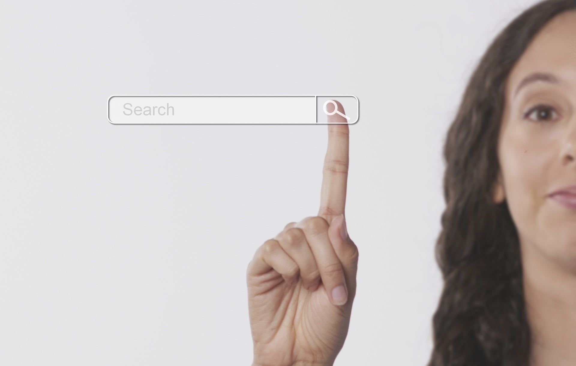 The humble search bar is perhaps the most effective weapon that you can offer. Needing to be prominently posted, it allows for the most direct and convenient form of browsing, thus making your site incredibly user-friendly. Forbes lists a visible and prominent search bar as essential to hit the fallback strategy that most shoppers hold. After they quickly find what they want, there’ll be enough time to browse.
You could also build on this with a search auto-complete feature, either completing words or dropping down to images of potential search results. A site that builds both of these into its essential search bar is Betway. You can see it along the top or on the categories bar further down where the slot games sit. Using the top search brings up a drop that has key phrases for quick searches and adjusts the text results as you type. Below, the search tool above the game tiles cuts down the tiles on show as more characters are typed in to make the process even faster.
It’s not a surprise that most of the biggest and suddenly successful eCommerce sites have a prominently posted search bar. Amazon’s the most generic example of this, but you could also look to online tile retailer Porcelain Superstore, which saw sales rise to £16 million in 2021. On their website, the first thing that you see is the search bar under the line “What are you looking for?” As you type, suggested pages, categories, and product pictures come up to ease your journey.
The hero product image and search bar should be embraced by all eCommerce sites and become the focus of homepages. UK buyers continue to respond well to both elements of web design because they catch the eye and make the journey to purchasing that bit easier and more enjoyable.